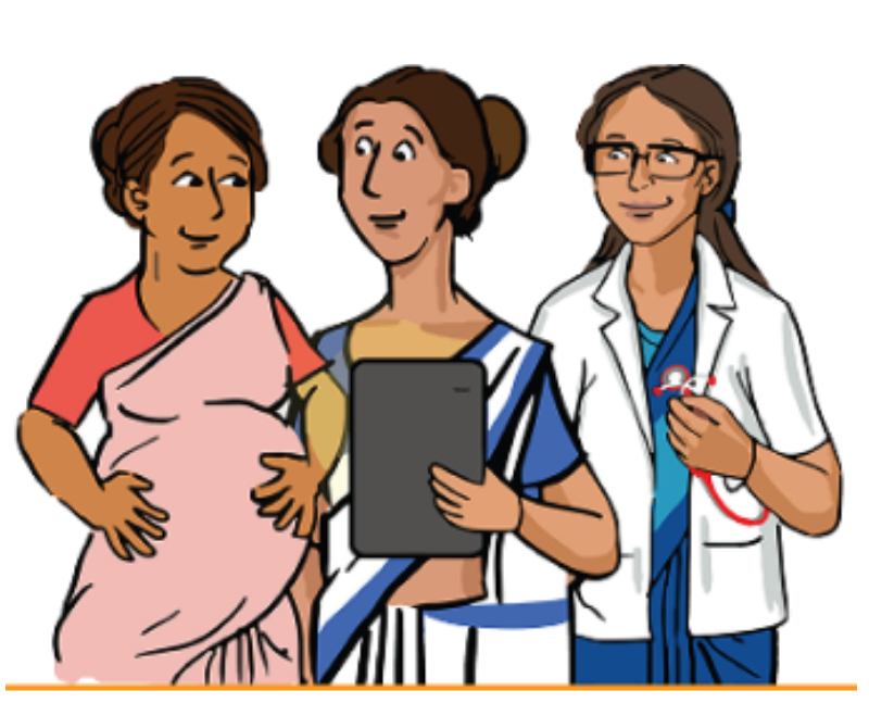
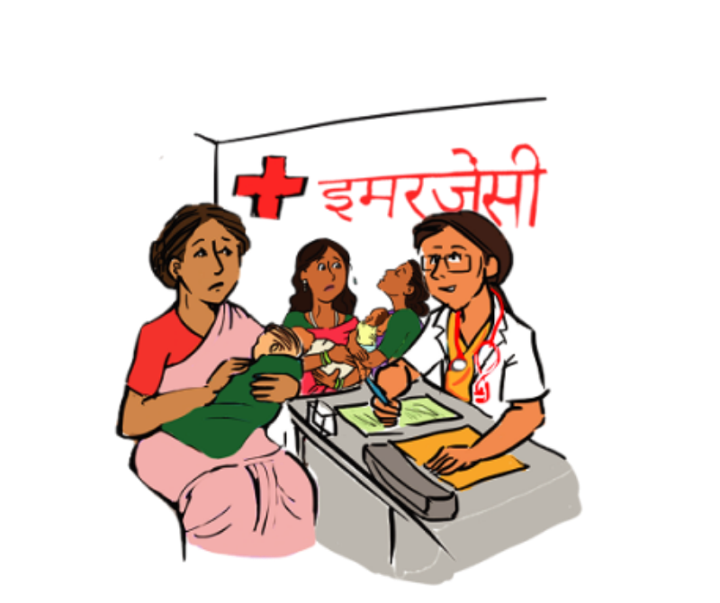
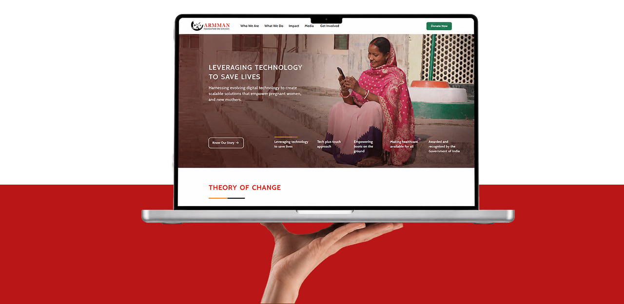
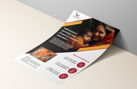
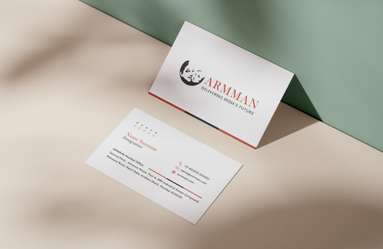
We translated ARMMAN’s tech-enabled, human-centred approach into a visual language that feels credible, warm, and accessible. The design reflects their “tech plus touch” philosophy, balancing innovation with the empathy and human connection at the heart of maternal and child healthcare.
We refined ARMMAN’s existing logo to create a cleaner, more contemporary expression while preserving its established identity. The refinement focused on improving clarity, balance, and consistency, ensuring the logo feels more aligned with ARMMAN’s technology-driven, human-centred approach while retaining the recognition and equity of the original mark.
Informing Women And Families, Training Health Workers At All Levels, Strengthening Health Systems.
We created a comprehensive brand guideline to bring consistency across ARMMAN’s visual communication. It defines the refined logo, typography, colours, imagery, and core visual principles—ensuring the brand stays clear, cohesive, and recognisable across every touchpoint.